- Written by Visible Legacy News
Navigator Update Released
We've updated the Navigator website with data and features to make it a powerful map-based search front-end to the open data from academic research. Most features are aimed at Industry Tech Scouts seeking innovations or talent emerging from the top 25 research universities. We have also added enhancements for Foundations sponsoring research and for university departments seeking to attract more industrial sponsorship.
The recent Navigator update January 2019 includes
- OTL data: Full mapping of inventions displayed on Licensing Office pages from the top 25 research universities.
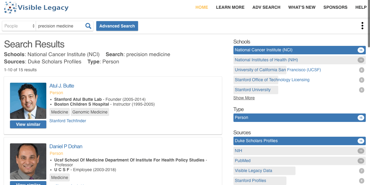
- Improved search: New faceted search controls over the search results lets you filter the results.
- Advanced search: Advanced Search has more powerful filters and logical queries.
- Recommended topics of relevance: "View Similar" button and relevance metric shows similar topics based on keywords.
- Projects: More project and grant data from the NIH Reporter data feed.
- Profiles: More profiles for investigators at the top 25 research universities including links and maps.
- Relevant Papers: Presentation of impactful papers featured from CV and grant project results.
- Grants: Smart concatenation of repeat grants make it easier to see successful collaborations.
- Metrics: Algorithmically capturing and presenting metrics to help research sponsors determine the impact of their programs.
- Better detail page: cards rather than lists for more compact presentation of details.
- Better topic cards: Topic cards have more details for fast overview.
- Cleaner timeline: Projects only on detail page allows map page to highlight important events.
- Patents: More patent links get you quickly to the USPTO.
- Fast navigation to primary sources: Single "best-link" to get you quickly to the original website for papers, patents, organizations.
- Faster graphics: Smoother, easier to read graphics.
- Faster load time: Data delivered as needed rather then all at once for faster load-time.
- Better maps: Enhanced graphs to emphasize collaboration clusters and projects.
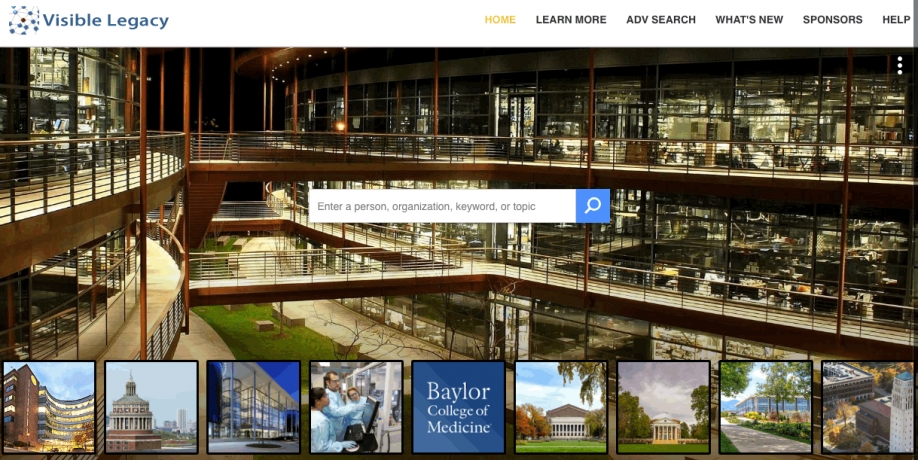
- Homepage examples: Featured organizations as rotating buttons on the homepage let you see examples quickly
- For your website: Improved maps in embeddable widgets for your website shows your context and impact clearly.
Please check it out here.